

U.N. Embraces Equal Earth Map in Another Empty Symbolic Gesture
“Resolutions like this one and the ideological agenda they promote are barnacles on our work here and the reason this institution is losing its credibility.”
Back in the summer of 2025, I wrote about the African Union’s push to replace the Mercator projection with an equal-area alternative as an ideologically charged campaign rooted in grievance politics rather than practical cartography.
The Mercator map that these morons were complaining about enlarges high-latitude landmasses for an extremely valuable trade-off: it preserves angles and allows for accurate direction-finding.
Despite its downside – distortion of size near the poles, the Mercator’s ability to maintain accurate directions and shapes is still its big selling point. It’s a trade-off that has proven successful for many forms of navigation, from historical sea voyages to today’s digital map searches. So even after centuries, the Mercator projection still plays a crucial role in how we explore and understand our planet.
There is no "disinformation" inherent in a Mercator Map projection. Apparently, the reasons for the navigation-based distortions go unlearned in today's geography class to make room for DEI. pic.twitter.com/lnISAgOVbB
— Leslie Eastman ☥ (@Mutnodjmet) August 17, 2025
Despite the massive poverty afflicting large swaths of Africa, a deadly Ebola outbreak in the Democratic Republic of the Congo, active wars at various spots around the globe, and drug cartels that effectively control territory and institutions in some countries, the United Nations has found time and energy to adopt “Equal Earth”.
The United States was the only country to vote against this inanity.
Friday’s resolution, which was sponsored by Togo and backed by members of the African Union, was passed with 164 member states voting in favor. Only the U.S. voted against it while six other countries – Serbia, Estonia, Georgia, Lithuania, Moldova and Ukraine – abstained.
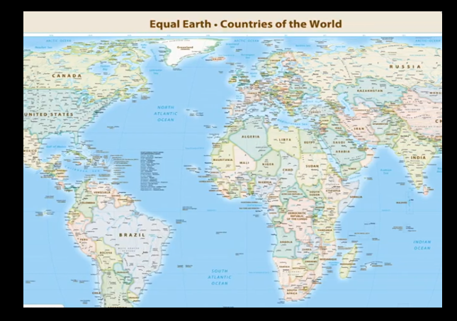
The vote encourages governments and institutions around the world to replace the traditional Mercator map, commonly used since the 16th Century, with the Equal Earth projection that advocates and geographers say shows locations more accurately.
…Friday’s resolution does not ban the Mercator projection or impose a replacement, but only encourages the use of the Equal Earth projection, the U.N. said in its report.
“Maps shape our understanding of the world,” the global body quoted Togo’s Foreign Minister Robert Dussey as saying before the vote. “They guide education, nourish the imagination, and influence collective perceptions.”
The Mercator projection makes Greenland and Africa appear roughly equal in size, but the Equal Earth projection preserves their relative proportions—revealing that Africa is actually about 14 times larger than Greenland.
Because surely that enlargement will make the African continent more prosperous and a healthier place to live.
The American representative shared my skepticism.
Yaryna Ferencevych, the deputy U.S. representative to the U.N. Economic and Social Council, said the resolution was presented as “an anodyne effort to update cartographic proportions” but was, in her view, part of a “much larger and more radical ideological project.”
“Instead of focusing on genuine problems of international peace, prosperity or good relations, this body is debating map projects from the 16th century and their role in promoting reparations and cognitive justice,” Ferencevych said Friday during the 114th Plenary meeting.
“Resolutions like this one and the ideological agenda they promote are barnacles on our work here and the reason this institution is losing its credibility.”
Ferencevych was referring to the Mercator projection, created in 1569 to aid maritime navigation. To this day, it is seen as the traditional world map and is used in many school textbooks and atlases.
The physical, resource-rich reality of Africa has always been exactly the same.
The soil didn't shrink, and the minerals didn't vanish just because a cartographer in 1569 drew a map a certain way.
Believing that a smaller drawing on a piece of paper holds back a continent's… https://t.co/82KM8FtMr0
— Farai Mazhindu (@FaraiMazhindu) September 5, 2026
And while UN bureaucrats may be celebrating this big achievement, Equal Earth isn’t a perfect map either.
It gives up some of the features that made Mercator useful for navigation.
Straight lines on the Earth do not work in the same way as they do on Mercator. It also cannot be used to measure the true distance between different places perfectly. This is because there is no flat map that can preserve everything at once.
As UCL cartography professor James Cheshire explained, “A map can preserve area, shape, distance and direction to different degrees but it cannot preserve all of them perfectly.”
BREAKING – The UN voted today to adopt a new world map
Canada was diminished on the map by 74%.
Donald Trump DID NOT do this one. pic.twitter.com/iLcMJEEZGZ
— Tablesalt 🇨🇦🇺🇸 (@Tablesalt13) September 4, 2026
The Equal Earth vote may make race-activists feel good, but it will not stop wars, fight Ebola, break drug-cartel power, or improve the lives of people living in poverty.
The fact that bureaucrats from 164 countries could unite behind a meaningless, nonbinding resolution about map preferences while the U.N. struggles with real crises says everything about the institution’s priorities.
African leaders pic.twitter.com/it2t2HeyRz
— ross mikizy (@MkzRoss) September 4, 2026
In that respect, the vote’s greatest value was showing just how much the U.N. has become a forum for empty gestures rather than serious action.
Finally: Here is something the African bureaucrats should be worried about…the economic size of countries, in map form.
Вот карта которая показывает экономические размеры стран. Эта карта информативнее карты размеров раз в 10 и показывает реальное положение дел. Её стоит всем африканским странам повесить в кабинетах https://t.co/xwpnXlg4Do pic.twitter.com/Iaw4mKpA68
— Николай, что пытается заработать 500к (@randomnikanona) September 6, 2026
Donations tax deductible
to the full extent allowed by law.



Comments
2/3 of the way towards embracing a Flat Earth. Would a majority vote also make it so?
Decades ago, there were these little classified ads at the back of magazines like The New Republic (worth reading in those days) and ones like Atlantic and Saturday Review.
One of them, put out by one or another of the groups looking for something about which to snivel offered a world map with the north pole at the bottom. In short, a standard map, but inverted. The message was that the evil nasty no-good rotten Europeans and Americans needed to be seen as beneath the parts of the world that were not civilized and were being oppressed blah blah blah.
Some folks have FAR too much time on their hands,
It’s all relative. /shrug/
Knowing what it’s about, I just shake my head and pity the fools.
The Mercator map is clearly racist due to its disparate impact.
It’s also lying about Greenland.
Fraudulent organization. Fraudulent man-made (or is that person made?) apocalyptic climate change. Fraudulent map. Nice consistency at least.
Make that “map.”
The map isn’t really fraudulent. It’s just being pushed (when there’s LOTS of equal-area map projections already in existence) as part of the grievance effort, to make certain people feel bad. With better knowledge, those people don’t even feel bad. They just point and ask, “Why didn’t you just use this one?”
Not fraudulent? I suggest that you take a look at that deformed blob of a land mass that’s supposed to represent the United States and reconsider that assessment.
Well, I do know it’s not fraudulent since I’ve actually explored maps a lot in the last 15 years. Including different kinds of projections. I have studied maps for more like 40 years in my schooling and profession. That land mass DOES represent the US and North America – pretty accurately on an equal area basis. The fact it doesn’t match the Mercator projection you are used to isn’t really good criteria to make your statement.
The deformed shape “DOES represent the US and North America – pretty accurately on an equal area basis”??? George Washington in his prime may have weighed about 175. An image of a 175 pound of slab of steel does not accurately reflect his appearance. Go study some more.
Inane and infantile symbolic gestures and pandering are more important to leftists/Dhimmi-crats than practical realities.
I use the analogy often that as leftist-governed politiies degenerate more and more into crap, the leaders’ response is always to expend effort to draw more attractive maps. This is one of the few examples of this principle where they are actually, literally doing it.
Looks like a list of 169 countries that have too much money and too little sense. Why in the world do we continue to subsidize the UN?
Because the allegedly conservative executive and legislative administrations have talked a good story but – like ridding us of various departments, commissions, bureaux, and other government bodies, talk a good story but do nothing.
Actually, not enough money. At least that’s their POV.
(I say, if you want to blow up this effort, require UN dues be based on this map; charge relative to the size of the country. BWAHAHAHAHA!!!!!)
Sometimes I wonder if God isn’t playing jokes on us with the shapes of the continents. Italy is a high-heeled boot that just kicked something off a tee and Africa looks like a poor starving soulful-looking child. Florida, now, um nevermind. Can the UN please do something about that?
A fascinating observation!
New York, the Empire State!
Tennessee, the Volunteer State!
Nevada, the Silver State!
Florida, in a flaccid state! /ducking
Clear proof that the UN has too much money. Why do we continue to fund our enemies?
Actually, I’m amazed at the size difference
Yes. And your objection is? Isn’t the General Assembly one giant symbolic gesture? Isn’t its entire purpose to make symbolic gestures? It’s not as if it has any actual power. The UN Charter creates the GA as a talking shop. A place for countries to vent at each other, make symbolic resolutions, and create backchannels for important communication between governments. So this resolution is right up its alley, by design.
Nothing the General Assembly does can achieve any of those things. That’s not its job. This is like condemning a high school “student government” for making resolutions about lunch while the actual school board is struggling with serious issues like budgets, educational standards, teacher scandals, etc. Lunch is what the “student government” is supposed to concern itself with.
As for the resolution itself, I’d have voted for it. I think every classroom should have a non-Mercator map on the wall as well as a Mercator map, and a globe on the teacher’s desk or on a shelf, so that kids grow up understanding not only the actual geography lesson, but also how to look at things like history and the daily news.
Of course in geography class kids should learn why the two maps are each inaccurate in different ways, and what each one is good for. But beyond that they should learn that there isn’t just one representation of the truth. Here are two flat maps that are very different, neither is more true or more accurate than the other, they’re just useful for different purposes, while the globe is the reality they’re both trying to approximate. That’s what history is like, and life; no history book or newspaper can capture the whole truth exactly as it happens; the truth must be “projected” in some way to be represented in writing.
I’d have voted for it.
I’d have insisted on one of the long-standing (for certain values of “long”) equal-area projections that already exist. I prefer the Goode homolosine. It’s got a cute little bump in the longitude lines to make it work, on top of the lobed layout. It gives a much better visual of the trade-offs. I’d include a conical projection of some kind, too. And you nail it with including the globe.
“I think every classroom should have a non-Mercator map on the wall as well as a Mercator map, and a globe…”
Outstanding demonstration that “The map is not the territory.” I think the globalist whine-babys mised the subversion they snuck in with this one.
My personal favorite is still realizations of Fuller’s triangle map schemew. Assembling the tiles around your point of interest makes it explicit: you are constructing a view to use toward some end.
PS As a teenager I had a Peters projection map on my wall. When West Wing did an episode about it, it was old news to me.
Its like de ja vu all over again with that West Wing episode, now in real life!
This new paper map is so 1950’s. We are moving away from an era where we look at representation on paper and moving into an era where we navigate through data. The Equal Earth vs. Mercator debate isn’t the beginning of a new way of drawing maps; it is the final, dying argument of a 500-year-old medium.
You will regret turning away from paper maps some day.
It also doesn’t stop the debate by making it digital. You still have to depict a spherical (oblate, really) surface in a flat representation to do a LOT of work with said data. Because we humans take in our world visually (to a huge extent).
As a licensed surveyor, I can tell you “Its not dead yet” in my Monty Python accent.
For navigation use the Mercator. For classroom comparison? Why not have both and then explain just why the Mercator is valid for its purpose and explain the differences. Seems to me that’s the purpose of schooling, to become educated v indoctrinated or worse form lifelong ‘knowledge’ that just ain’t so.
I have had folks argue with me about the relative size of areas based on their only having familiarity with Mercator. ‘That’s the map in the HS classroom are you saying it was wrong?’ Kinda like some folks insist on the exclusive authenticity of the King James Bible as the true and complete revealed ‘Word of God’ and view any other Bible version, much less any other texts, as some form of heresy.
Yes, the Bible one is … SMH. “Understand, Skippy, that’s a translation. It only conveys original meaning if it’s translated to words and phrases today that mean the same thing.”
And, maps are the same way. You have to use one that fulfills the purpose for which you need it.
I did hear once, during the initial push of the New International Version, “If it was good enough for St Paul, it’s good enough for me!” about the King James. And they were not joking. Oy oy oy.
Yeah. When folks really believe there’s only one ‘true’ viewpoint (their own) despite clear evidence to the contrary then every other differing viewpoint is rejected by them as wrongheaded, false or heresy. They usually don’t wanna try and discuss the differences either. They’d rather apply labels and move on probably b/c they really know deep down their own position is vulnerable.
An symbolic empty gesture map spawned by the symbolic empty gesture UN. “Useful for what” exactly? A “projection” of the truth according to Milhouse. LOLOLOL.
Milhouse is right. A flat map projection of the oblate spheroid that is Earth is going to have to be made to purpose to be accurate. And it’s near impossible to do that where lat-long and directions are correct AND landmasses are properly sized in relationship to each other.
BTW, one reason the Army uses grid maps instead of lat-long is to eliminate the distortions that come along in a place where the longitude lines converge at all. It also eliminates the need for converting true and magnetic north.
I stand corrected!
This map clearly lacks credibility. There is no Gulf of America.
I don’t see Guam either. I think it tipped over.
So, use both.
A bigger Africa more accurately represents its load on the civilized world.
What is the problem? Is it more “fair” to Africa? No, it’s not. A map isn’t about “fairness,” it’s about usefulness.
A little kid from Rwanda will still have a difficult time finding their country on the new map without a magnifying glass.
Or Mauritius, or Djibouti, or Burundi.
And he still won’t even know about the map if he lives in a village so poor they don’t have a schoolroom wall to put it on. Or if his culture is so awful they can’t even value knowledge or the morals required to build civilization.
There’s no need to spend billions of dollars to print new maps for every school house in the world. Just print enough of the new maps with big Africa and ship them to Africa so the African kids will feel better about themselves.
Well, then, you obviously haven’t paid attention to the folks stating that different map projections serve different purposes and should be used for those purposes. If that little kid in Rwanda doesn’t yet need to know how to navigate the globe, but needs to have some knowledge of the relative landmasses on Earth, then an equal-area projection is a better option. If he needs to study how to fly (or sail) a great-circle route from Africa to South America, then the Mercator projection it is. If he needs to fly preset high altitude air traffic routes he needs a map that displays those routes as well as possible – which might not require either conformal or lat-long accuracy.
If he needs to demonstrate which country he represents as a newly appointed ambassador, he should use a globe. Though, honestly, just about any projection will work for that. (If you don’t know that reference, look up George Schultz and his test for an ambassador.)
If you use stereographic projection a Delaunay triangulation stays correct.
This is much ado about nothing. All projections of a globe onto a flat surface have benefits and drawbacks. A projection good for navigation isn’t good for giving people an idea of the relative size of landmasses and countries. This map addresses the latter use. What is the problem? Is it more “fair” to Africa? No, it’s not. A map isn’t about “fairness,” it’s about usefulness. This map is useful if you want to see the correct relative sizes of its various features. It serves a particular purpose, as does every other projection. No single projection serves all purposes. This does not make any of them “good” or “bad,” or “better” or “worse.” All involve trade-offs. None are perfect.
This map is politically motivated? And opposition to it is not? It’s a map. Like every other map, it serves a purpose and isn’t useful for every purpose.
Get a grip.
Perhaps someday, far in the future, someone will invent the globe and then it can be placed in classrooms to show school children what the world really looks like.
The push for it is politically motivated. It’s another way to use Science! to try and bully civilization into giving away its wealth to others. And possibly, the use of that particular projection is political. (The Lambert cylindrical equal area projection is from 1772.) And, the idea that it should ever replace the Mercator* is silly.
(* There are other conformal projections that people argue over which is better, too. )
And a good cartographer and/or surveyor knows why each one is used for a particular projection.
This size difference is not new.
When I was in grade school, they had a now little-known thing: a Globe.
The relative sizes were well known way back then.
Exactly. Avoid the brouhaha and use a globe. That has the added bonus of showing why great circle routes are not as crazy as they might seem on a flat map.
I would actually argue that the Mercator map has outlived its usefulness and should be scrapped. The whole point of the Mercator map was that it’s the most useful one for navigation, and navigation was the original purpose of maps in the first place. You wanted a map so you could get where you wanted to go, and for that purpose you can’t beat Mercator. But nowadays everyone navigates by GPS. Unless you’re in the Scouts or some equivalent, no one uses dead reckoning, any more than they use sextants and astrolabes, or takes a noon sighting of the sun. So what use do you have for a Mercator map?
Technology…what could go wrong? I hear you on partial obsolescence, but manual skills are valuable, especially for educational value, as you mentioned earlier.
What will you be using the new map for?
Learning what the world is like, which is what geography class is supposed to be about. And Mercator is not well suited for that purpose.
There’s a Golden Globe Race just started, sailors going nonstop around the world, which is all by dead reckoning and sextant. 1968 technology rules. Though if you meet a passing ship, you’re allowed to ask by radio what their position is.
https://goldengloberace.com/
There is live streaming from many of the boats on a rotation, skippers’ choice.
And they are obviously using Mercator maps. Good for them. But school is not training kids to do this, and it’s not supposed to do that.
Everyone does that, huh? And when your GPS goes out? Don’t be so quick to dismiss the older ways because technology makes it easier. That’s a good way to end up with a bunch of people doing something that they have no idea how to reproduce the tools.
What use do we have for the U.N.?
Do you mean the UN, or the General Assembly? The UN has its uses, or at least it used to have them. The GA has never had any uses, and was never meant to have any. It’s purely decorative, by design.
Even the parts of the UN that semi-worked were still an attempt to peacefully bring the world into a globalist state.
Military still teaches and uses dead reckoning as do all sorts of folks in various outdoor activities/situations. The use of a map and compass are very handy skills to have out in the real world without access to electricity/batteries. Sure most people in the USA live in a few huge sprawling metropolitan clusters but a significant amount of folks still live, work, play in ‘flyover country’ or abroad in areas where a signal is intermittent and access to power uncertain. Tough to use a powered down GPS without any signal access to navigate.
Frankly I’d argue we, as a society, should bring the teaching of these sorts of basic skills into K-12 since the external sources of this instruction have eroded. Teach Land Nav, basic firearms safety/handling, use of basic hand tools and power tools, ‘homeowner’ level repair/maintenance of electrical/plumbing (fix/replace a faucet/install an outlet) basic carpentry to repair/build a set of stairs or a deck. Basic gardening more/less focused on getting soil correct for whatever is planted, what and how much nutrients to add. IOW things practically everyone knew 75 years ago but have fallen out of favor to make our Citizens more self reliant, adaptable and confident.
The use of a map and compass are very handy skills to have out in the real world without access to electricity/batteries. Those are local maps, not global. The difference between projection methods is irrelevant at that scale.
Not entirely. If you’re in the 30s of latitude, yeah. If you’re in the Tropics, yeah. If you’re above 60 degrees? Even local maps need to make trade-offs.
All my flying was done with map and compass, no electronics. The trick is to fly straight until you know where you are, then make the correction. The problem is judging whether that landmark is not on the map because you’re lost or because they just didn’t put it on. You have to wait and see what turns up, then fix it.
Nah man, no bait and switch on this discussion. You framed navigation as ‘justification’ for Mercator and made the argument that GPS navigation aids rendered ‘dead reckoning’ and Mercator obsolete.
It is disingenuous to try and switch your argument when we’ve clearly demonstrated that map and compass and even dead reckoning are not just valuable skills but very much still in use.
by this logic, it is also useless to teach handwriting skills (particularly cursive), memorizing the multiplication tables, or doing math work with pen & paper (and brain).
~~ cursive allows one to read many ORIGINAL documents ~ or we can rely on what we are TOLD they said
~~ memorized multiplication ~~ allows for recognition of faulty numbers often used in arguments or simple calculation errors
~~ math brain work teaches relationships of numbers so one can recognize that 50cents is HALF of a $1.00
etc
And learning to read a flat map teaches how to understand physical relationships, NSEW compass, and distance ~~ try and give someone a route to follow using direction and distance and see how lost they get ~~ most can only navigate by instruction given in left/right and “go to the 3rd light” … They have little conscious understanding of direction or distance (and often even time) if it isn’t spewed out of the GPS for them
“Finally: Here is something the African bureaucrats should be worried about…the economic size of countries, in map form.”
To paraphrase MLK, “I dream of the day when little countries will be judged by the content of their productivity and not the size of their territory.”
Once you go Greenland, you never go back.
I’m starting to think trump is in the pocket of Big Map. Think of all the elementary schools will have to spend when he renames bodies of water or enlarges a continent.
Big Map might be the funniest thing I’ve read in weeks!
You’ve heard of the Rand Corporation, surely?
You win the internet today.
You mean the Rand-McNally company?
The Rand corporation is different.
Sure it’s different. Sure.
I want to see Pangea and Gondwana! My non-human ancestors are being erased! Garrrrh!
Here’s the thing…Don’t b***h about this map thing making the landmasses equal. Do shake your head at the stupidity of WHY they’re doing it.
Because surely that enlargement will make the African continent more prosperous and a healthier place to live.
Now, they do seem to believe this. But you can’t argue with the idea of a map that actually represents the landmasses in their proper proportion. Or, at least, you shouldn’t argue against it, because that argument is stupid. A map can be used for different things, and should use a projection appropriate to its purpose.
But, here’s the thing: there are already projections in existence that do this very thing.
An equal area projection is Gall-Peters. Another is Goode homolosine – it’s not a common one because it is lobed, instead of continuous, border-to-border. Boggs eumorphic is another lobed equal-area one. Robinson is a compromise projection that looks similar to a Mercator. Bonne looks like a heart and attempts to represent equal-area AND equidistant. Then you have the population maps (that show relative country position, but distort its size to represent its population). Or economy size maps. Or any other heat map or similar representation (I’ve seen one that shows electoral college ‘sizes’ or for how much of a soda brand is sold somewhere.)
All of those and a lot more all strive to achieve some particular representation of reality.
As long as you don’t claim Absolute Truth with any one of them, you’ll be fine. And, using the one that achieves your objectives. Making a cartographer fight into something moral is kinda dumb.
Oh, bloody….
The italics should have closed after “do this very thing.”
/sigh/
“A map can preserve area, shape, distance and direction to different degrees but it cannot preserve all of them perfectly.”
Well, that’s not entirely true. A FLAT map cannot represent all of those things perfectly, simultaneously. A globe does a fine job of that.
“Do shake your head at the stupidity of WHY they’re doing it.”
To boost the self-esteem of people who apparently have no other source of it.
They could print the map on rubber and then each child could stretch their own country and make it look as big as they want.
You understand they are just using real science (cartography) to whine about their helplessness and sad state of affairs? This new map isn’t actually false or anything. It’s accurate – for the purposes for which it was designed. Trying to make people feel guilty about not using for other purposes is where the stupidity comes in.
Wait… if the “resource-rich reality of Africa” is a thing, then why do African countries “need” reparations from whites/ Europeans? Can’t they just tap into their own rich resources and eliminate blinding poverty in Africa once and for all? If they’re sitting on wealth untold, why do they still want handouts?
Are African countries demanding reparations? I thought only “displaced ” Africans did that.
I’d like to see a map based in UN contributions and frankly votes should be apportioned on the basis of contributions. The latter only if we stay in the UN.
Look, more dumb people doing dumb things. It’s another day that ends in Y.
Idk but I am pretty excited that the $800 million the US give the UN each year is being used so productively!
/sarc
The fraction of that money that goes to fund the General Assembly is pocket change.
It would cost hundreds of millions of dollars to make new maps for every classroom in the world.
Africa happens to be the continent with the most starving children in the world. Over 13 million children across the continent suffer from acute malnutrition. Perhaps it would make more sense to use the money to feed starving children instead of new maps.
It would, however, help students understand things like cartography (map-making). It would get more facts and knowledge into their heads, instead of fewer. And, it might provide good perspective on critical thinking, rather than simply accepting what they’ve been told.
We’ve got plenty of money going to feed starving children. Lots and LOTS of it. Work on trying to get those peoples and nations to put their land and our money to good use on building things like farms and such – so we don’t have to send their grandchildren money and food in the future.
Why on earth would they do that, when they have an app on their phone?
/sarc
But leftists are theatre kids. It’s all about the LARPing. Anything else is real work.
In reply to: Concise in reply to GWB. | September 9, 2026 at 7:26 pm
OK, you are not very bright, are you. You’ve just proven my point.
The picture of a steel beam that weighs 175lbs would be perfectly accurate for portraying how big a steel beam is at that weight. Particularly if it was next to a picture of George Washington at 175lbs, to the same proportions. It would give you relative size. If your goal was to demonstrate how big GW would be if he were made of an appropriate amount of steel, it might also be useful.
And, can you point out – with reference to something other than a Mercator projection – how the shape of the US is distorted? Perhaps measurements? Perhaps Euclidean geometry?
Oh, for those going on about globes…
The Earth is an oblate spheroid. It’s not a perfect “globe.” Yet, most globes are or are close to it. A compromise born of manufacturing necessities – an oblate sphere is really hard to make, comparatively speaking.
Also, a great many globes put the rotational axis of the Earth at the exact point where all the lines of longitude meet on both ends. This is not accurate in the long run. Even the tipping many manufacturers do is inaccurate over time as the Earth wobbles.
But, a globe is probably THE most accurate compromise in cartography for representing everything as closely to reality as is reasonable.
Of course, the UN dues should be assessed according to their land mass.
As a social studies teacher, I actually like equal area maps, even if the Peters Projection gives us locally distorted shapes of landmasses near the poles. My first map in childhood was a globe; and in middle school, we got the Goode’s School Atlas, which used a kind of “orange peel” projection.
But I also understand that the Mercator projection, which projects the shapes of landmasses onto a cylinder and unrolls it, was designed for use by navigators for whom degrees were more important than miles, and who wanted little local distortion of the shapes of landmasses. It was not, as too many post-modern ignaramouses claim, designe to bolster white supremacy by making Europe look bigger than it is.
You had the Goode homolosine!
These people are idiots, er, more than you’d think. Graphics illuminating world n national data is what Gapminder Foundation does:
https://www.gapminder.org/
Gapminder, affiliated with the UN, and uses much UN data.
Uses via related visualization software vizabi
https://vizabi.com/
Which includes world maps as built in presentation format.
All this developed following in Hans Rosling’s public health analysys, presented in a few of the about six useful TED talks:
https://www.ted.com/speakers/hans_rosling
Aaaand I will not look into what Tableau supports lately, or dynamically resizing map projection sacks on top of postgres GIS capabilities. Don’t even talk about built in pan, scale, and zoom in video games. HUD projections. Dynamic visualization of ship, aircraft and satellite swarms
You can literally scale and position any shapes you want, with any interaction rules you want, on any geometry you want, fed with position-correlated any info you want, at planet scale in near real time. I want the countries floating above then map plane by how much BS their delegation spewed in the last hour, distances between tracking their mind virus alignment.
This isn’t even hard any more.
.
.
.
Unless this isn’t about illuminating views of the world.
Nevermind.