African Union Wants End to Mercator Projection Map Use Over “Disinformation”
The reason? African Union member unhappy with the relative size of the continent presented on those maps, as it makes them feel…marginalized.
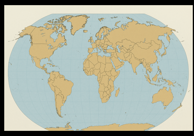
The African Union (AU) has kicked off a disturbing, racialist campaign to end the use of the 16th-century Mercator map by governments and international organizations.
The officials from the organization want the adoption of a map system that more accurately shows Africa’s actual size. The AU asserts that the Mercator projection distorts global perceptions, “marginalizing” Africans in ways harmful to their “pride”.
“It might seem to be just a map, but in reality, it is not,” AU Commission deputy chairperson Selma Malika Haddadi told Reuters, saying the Mercator fostered a false impression that Africa was “marginal”, despite being the world’s second-largest continent by area, with over a billion people. The AU has 55 member states.
Such stereotypes influence media, education and policy, she said.
Criticism of the Mercator map is not new, but the ‘Correct The Map’ campaign led by advocacy groups Africa No Filter and Speak Up Africa has revived the debate, urging organisations to adopt the 2018 Equal Earth projection, which tries to reflect countries’ true sizes.
“The current size of the map of Africa is wrong,” Moky Makura, executive director of Africa No Filter, said. “It’s the world’s longest misinformation and disinformation campaign, and it just simply has to stop.”
Fara Ndiaye, co-founder of Speak Up Africa, said the Mercator affected Africans’ identity and pride, especially children who might encounter it early in school.
These bureaucrats are planning to get the United Nations Committee of Experts on Global Geospatial Information Management (UN-GGIM) involved in the madcap scheme.
The campaign said it has sent a request to the UN geospatial body, UN-GGIM. A UN spokesperson said that once received it must be reviewed and approved by a committee of experts.
Other regions are backing the AU’s efforts. Dorbrene O’Marde, Vice Chair of the Caribbean Community (CARICOM) Reparations Commission, endorsed Equal Earth as a rejection of Mercator map’s “ideology of power and dominance.”
The Mercator map traces its origins back to 1569 when Gerardus Mercator, a Flemish cartographer, wanted to solve the navigational challenge of depicting a spherical Earth on a flat surface. His map projection system enabled sailors to plot straight-line routes that represented constant compass bearings, which was a significant breakthrough for navigation at sea.
By preserving angles and allowing for accurate direction-finding, the Mercator projection revolutionized maritime travel, and it became an indispensable tool for the historic voyages during the Age of Exploration.
Today, the usefulness of the Mercator map endures, especially in digital mapping platforms that we all know and love.
Fast forward to today, the Mercator projection is still incredibly relevant, although its use has evolved. Now, it has found a new home in the world of digital mapping. Online mapping services like Google Maps, Bing Maps, and Mapbox use this projection because of its unique characteristics. Its ability to maintain accurate angles helps provide consistent maps at all zoom levels. When you zoom in or out on a digital map, its the Mercator projection working behind the scenes that maintains the true shape and angles of roads, coastlines, and buildings.
Despite its downside – distortion of size near the poles, the Mercator’s ability to maintain accurate directions and shapes is still its big selling point. It’s a trade-off that has proven successful for many forms of navigation, from historical sea voyages to today’s digital map searches. So even after centuries, the Mercator projection still plays a crucial role in how we explore and understand our planet.
Sorry, this is just not practical.
Mercator map is the one used by everyone because it works. When you go on a straight line in real life, you can draw it as a straight line on a map using Mercator projection. You would have to draw it as a curve in any other projection.
Simply… pic.twitter.com/w6t4DvqcgV— Peter Jaroch (@PeterJJ_) August 16, 2025
When I took my geography class at Wayne State University, I began to appreciate the navigational component of Mercator maps. If I needed to assess the scale of continents, I would refer to a globe.
Perhaps it is time for officials to stop racializing crucial technologies and embrace the power of effective mapping systems…even though white men invented them.
If you are basing your pride on the relative size of the landmass of your continent rather than the accomplishments of your people, then something is wrong with your approach to life….no matter your race, creed, culture, or ethnicity. Teach your children from both a globe and a Mercator map, as that is the best way.
There is no “disinformation” inherent in a Mercator Map projection. Apparently, the reasons for the navigation-based distortions go unlearned in today’s geography class to make room for DEI. pic.twitter.com/lnISAgOVbB
— Leslie Eastman ☥ (@Mutnodjmet) August 17, 2025
Image by perplexity.ai
Donations tax deductible
to the full extent allowed by law.


Comments
It sounds to me like someone’s trying to make up for some other size deficiencies
Like intelligence?
I had an Egyptian friend who would go into instant fight mode if you ever dared to call him a “African”
Gee…I wonder why?
Brain.
Oh bugger off.
Let’s move the prime meridian to
Salisbury RhodesiaHarare Zimbabwe while we are at it.Gao, Mali.
There’s a joke here applying to 1/2 the population.
Only 10% of the global population lives at or near the equator. The other 90% have their home ‘diminished in size’ by the Mercator system.
FINALLY! As a middle aged hetero white dude, finally I get to rack up some points on my Grievance Score™
“The African Union (AU) has called for the accurate size of Africa to be reflected in maps.”
I guess the African Union thinks no one has ever seen a globe.
Stereographic projection is the one to use if you want to Delaunay triangulate the globe (convert a set of points on the globe to sensible triangular faces).
Windows 95 flight simulator wouldn’t let you within 50 miles of either pole because latitude and longitude were so hopelessly bad as x-y coordinates. You just banged into an invisible wall like a fly hitting a window pane.
Those were Microsoft’s “event horizons” for the singularities.
That was their global warming threshold.
I lol’ed at this.
Considering the fact that Africa has the lowest production of any continent (probably even lower than Australia! … though the Africans can certainly outdo Antarctica) Africans should be happy that the actual size of Africa is reduced a bit in representation. To have so much land area and so many people … and to produce nothing. Who would want that picture to be larger for everyone to see?
On top of all that, Africans are free to use whatever maps they want. They should shut their pie holes about what maps the civilized world uses. They’ve got enough on their mind, now, working to grind what’s left of South Africa into worthless dust.
Maybe they should invent a map projection? One that suits their purposes.
It is well known that the scale of the map is way off. The African Union folks who don’t like it are perfectly free to develop a competing map and use that as much as they like.
When they try to bully others into giving up the map that we’ve been using our whole lives, they can just go to the edge of the map and jump off.
A straight line in real life is a great circle, which is in general bent in the Mercator projection, so I don’t know what the expert is talking about.
Mercator is good for star sightings, is perhaps what would be the navigational component that ought to have been elaborated.
Yes, great circles appear curved on a Mercator projection, but rhumb lines are straight. If you want a heading to somewhere, one that you can keep steady at all times and will take you where you want to go, Mercator will give you that. If you fly a great circle you’ll get there quicker, but only if you keep changing your heading. Each is useful in its own way.
The idea of constant bearing decouples from the idea of straight. Think of going east one mile distant from the north pole. It appears to you at the time even as sailing in a circle.
Irrelevant. If you want the shortest route, use a great circle. But usually sailors aren’t interested in that; what they want is a constant bearing, and for that you use a rhumb line. It doesn’t need to be straight. What it needs to be is useful. And what gives it is a Mercator map.
I am really happy to hear that the African Union is utilizing their time and resources on the things that truly matter!
What? You don’t think grifting more money out of the West is what truly matters?
I can tell these idiotic African leaders that Africa’s pathologies and long-running problems have absolutely nothing to do with the continent’s depiction on maps.
This idiocy is consistent with the perennially infantile behavior of leftists/Dhimmi-crats/socialists/communists — always obsessing over and engaging in hysterics and histrionics over totally contrived, alleged grievances, while ignoring dealing with and solving substantive, real-world problems.
These fools are totally useless — don’t look to them to engage in substantive policies and rational behavior that might actually help Africa and Africans.
This must be an example of that indigenous science we were all discussing this past weekend.
No, it isn’t. This is real science; it highlights that all rectangular world maps are wrong in some way, and you have to choose the one that best suits the purpose for which you want it.
But it is an example of what the blue-hairs mean by “indigenous science.” What’s important about the map for purposes of this is not all of the geographic pros and cons of this particular projection, but the feelings of some people in Africa (who don’t even really represent many of the “indigenous” folks there). And that’s what all the blather about “indigenous science” is really about – stomping out success and reality, all to fulfill the emotional needs of the “victims.”
“the Mercator affected Africans’ identity and pride”
Africans feel inadequate?
Boo freaking hoo.
Trans your continent into its own planet for all we care, just shut up.
Or, maybe, just give it a reason to be proud. You know, do something important or useful.
They can’t. Dah whi’ man be holdin’ dem down!
Yep, by dissin’ dey size.
Not purely relevant, but since this is the most “international” article today:
Ron Coleman tells the British Government to FO:
https://xcancel.com/prestonjbyrne/status/1956391746029428914
Nothing new about the objections to the size distortions inherent in the Mercator projection. In Chapter 2 of his 2005 book “Why Geography Matters,” author Harm de Blij tells his readers that in the 1980s The National Geographic Society adopted the Robinson Projection as their standard world map. This projection still distorts sizes, but Greenland shrinks a whole lot. The USSR shrunk by 47%. At a news conference announcing the change to Robinson Projection, a reporter asked “Why has it taken you so long to make this change?” The reporter complained that Mercator reduces the size of Africa which constitutes “cartographic imperialism.” Of course the Robinson Projection will lack the conformal property where the scale factor is isotropic (same in all directions). A straight line on a Mercator map provides a rhumb line which is an arc on the globe crossing all meridians of longitude at the same angle. One can see that in the old days before modern navigation techniques, a sailor would draw straight lines on his charts using a ruler. Of course there were complications such as the difference between true north an magnetic north.
Maps are used for purposes other than navigation, so you choose your projection in accordance with your propaganda. Did sub-Saharan Africans ever navigate the seas? What have they invented? It seems to me that they mostly complain about the white man instead of making real contributions both to the world and themselves.
As a cartographer, I agree with your assertion.
It’s true. For them to use this map is nothing but cultural appropriation.
Wow! Africa is twice as big as I thought it was. There is no need to allow African immigrants to come over here since they have a lot more room on that great big continent right where they are.
We have been deceived by map disinformation put out by Gerardus Mercator in 1569.
While the size distortion point may be valid – Greenland looks bigger than Canada but is actually only the size of Saudi Arabia, the Equal Earth projection is equally invalid, it simply transfers the points of distortion.
You’ll also note that the map offers a near Afro-centric perspective as its central point is south of Ghana, west of Gabon.
This very topic was the scene in a 2001 episode of “West Wing”:
https://m.youtube.com/watch?v=eLqC3FNNOaI
I guess they thought we didn’t watch that episode.
They were right, for all of me. I didn’t watch any of their episodes.
Then you missed out. It was a good show, and if real-life Democrats were as well-meaning and intelligent, albeit clueless, as Josiah Bartlett, we’d be a lot better off as a country. The harm Bartlett could do was limited by the inherent goodness of his character, and the quality of his education. Maybe there used to be Democrats like that in real life, though I don’t know when.
Jimmy Carter?
Not in the slightest. Carter was neither clueless nor good.
In the inconceivable event that I had wanted to watch an hour-long infomercial, I had plenty of other channels where I could do that, without them being incessantly interrupted by “Inception-style” commercial breaks.
Dear Africa,
Make your own map and make it as big as you want.
And then, try to get anyone other than ignorant blue-hairs to use it.
Dear African Union:
No.
-signed- the rest of the world
This is not new. Many many decades ago I had a Peters projection map on my bedroom wall. And I agree that it’s important that children be taught that Mercator is not the only valid projection, and classrooms should have some other map as well, that preserves area at the cost of distorting shape and direction, in addition to Mercator, which preserves shape and direction at the cost of distorting area.
How many kids leave school with the idea that Greenland is incredibly huge, so much bigger than even Australia, when in fact it’s only about 2.7 times the size of New Guinea and Borneo. Likewise, how many understand that while Alaska is the biggest state, it’s only a bit more than twice the size of Texas, despite looking so much bigger on a Mercator map?
So yes, Mercator has its flaws, and that should be part of a basic education, but at the end of the day for all practical purposes it’s superior to any other projection. If you want to recognize an island’s or country’s shape, Mercator is the projection that gives it to you accurately. If you want a heading, Mercator gives it to you accurately. And it’s not wrong, it’s just another valid way of looking at the same reality. Just don’t think it’s the only way.
Agreed. Use the Mercator map due to ease, familiarity and practical application but also demonstrate in classrooms why the size distortions exist in it. There are plenty of people who have no idea that the Mercator map doesn’t accurately depict relative size.
Seriously? Today’s educators are still fumbling basic principles of biology like “you are a girl” or “you are not a cat and may not use a litterbox in class”.
Is geography even taught, except to point out which parts of the world are Nazi white colonialist oppressors and which parts of the world belong to noble POC?
Worrying whether school children are being taught the real size of Greenland should probably be way down the list of worries about what goes on in government schools.
Settle down. That ain’t true everywhere b/c some communities have managed to prevent a wokiesta takeover of their community schools. What I’m proposing would take 10-15 minutes tops. Use superimposed images of Nations and Continents onto each other to demonstrate the actual sizes. I don’t see how spending 10-15 minutes on a visual presentation to convey truth/accuracy v distortions is objectionable.
FWIW in my local rural school district we don’t have wokiestas running the show, introducing all sorts of woke ideological nonsense. Primarily b/c we stay involved and aware of what’s going on in our community schools…which are in the top 15 of the State in student performance on our State mandated proficiency testing as well as ACT/SAT scores and routinely produces multiple National Merit Scholars…that’s with graduating class size of roughly 100 Students +/-. each year. If your local school is run by tattooed, pink hair dyed, septum ring wearing weirdos spouting wokiestas garbage then you got some work to do in your backyard.
Use superimposed images of Nations and Continents onto each other
Heck, just overlay the different standard projections on each other. Let the kids see how they stack up. There are websites that handle this with a few pictures and 5 minutes worth of reading about the pros and cons of each. As you note, it’s easy to teach.
(Why do I know that? Because I worked on fantasy maps for entire worlds on several occasions. And knowing the true size of land masses is kind of important, as well as “navigation.” So I learned how to convert maps back and forth, and to break out smaller maps in ways that kept their “true” shape and size. It was a very fun rabbit hole.)
I think classrooms should have a non-Mercator map on the wall as well as a Mercator map, so kids are aware of the difference. There can be a 15-min discussion of the differences, and that’s it. Lesson learned.
If children are not taught that the Mercator projection map distorts the size of land masses as you move closer to the poles, then it is just another case of educational malpractice…
“the idea that Greenland is incredibly huge, so much bigger than even Australia, when in fact it’s only about 2.7 times the size of New Guinea and Borneo.”
It only FEELS that big when you’re stationed there.
Africa would be lucky to rise to the level of marginal.
Dear African Union: no one cares what you want.
“It might seem to be just a map, but in reality, it is not,”
Yes, actually it is just a map
I’m glad they have solved all the problems in Africa that now they can get to maps
Global maps, much less. Not local ones that might have meaning for the actual inhabitants of Africa.
Having only local maps would also help greatly ease their feelings of inadequacy.
A Rhumb line, or line of constant bearing, is a curve on the globe. It has a constant angle with every meridian it crosses. Follow it long enough adn it will take you to one of the poles. For short passages, it is the line most often used by navigators.
A straight line on the globe is a line of constantly changing bearing. It is called a geodesic or, most often, a great circle. It is usually used when the distance to the destination is a long way off and significantly shortens the passage. Unless you are using an autopilot tied to a GPS navigator, it can only be approximated by changing direction at intervals of some set distance.
Western Civilization: we devised a two-dimensional mathematical method to work around a navigation problem thereby enabling human advancement through trade and explorations.
Africa: You said there be no math.
How funny. It isn’t good enough that Africa is portrayed as the center of the world around which all other continents revolve. AU would prefer to be shifted away from the center of attention to the margins so they can appear to be bigger.
Like Professor Marvel…?
Once again, this is form over substance. Africa has more problems that a map, especially with the AU has no viable alternative. Africa has the resources, land, and population to be more successful than it is. If they really want to improve, they need to start planning for success, educating their citizens, encouraging developement of their resources, and enticing businesses to build and open there. Not an impossible task, but one that needs definite goals and leaders capable of moving towards those goals.
But this is in perfect congruence with shitlib doctrine: when your policies have rendered the territory you own increasingly ugly, draw increasingly prettier maps of it to delude people.
The endgame of this approach is a bizarre singularity — when the territory gets so unacceptable that people cannot avoid noticing they are walking in human poop, draw amusing maps of where the poop is located.
I suspect that Rhodesia and South Africa are evidence that Africa is moving in the opposite direction of what is needed.
advocacy groups Africa No Filter and Speak Up Africa
Those both sound like college campus groups for blue-haired psychopaths.
A globe. Classrooms should have a globe to show what 2-D maps cannot.
The first group sounds like an advocacy group for dysentery.
Not against it, for it.
Also, is this map envy? They saw Trump looking lustfully at Greenland, and thought “We’re bigger. Why doesn’t he want to buy us?”
(Greenland being so huge on the map because of that spread in the Mercator projection.)
america capitulating to the world is only made possible by a lefty government
I just remembered something. Decades ago I saw small advertisements in some magazines for a map that put the south pole at the top; everything else was turned 180 degrees vertically as well. The ad copy stated it was to get rid of the perception that Europe and America were superior because the Europcentric map systems put them on top blargle blargle blah blah.
I wonder how many were sold?
A bunch because they were a novelty. Not very many for actual purposes of geography or navigation.
They were popular with around 48% of Americans.
Arab cartographers used to put south on top of maps. The current convention to put north on top is completely arbitrary, and makes neither more nor less sense than the opposite.
In ancient times, to the extent that maps even existed, it was common to put east on top.
If you stand on the equator facing the direction of rotation, the north pole will be to your left.
If you stand on the sun, facing the direction of rotation, the same pole will be to your left.
North is the top of the sun, the point that is it’s ‘face’ as it moves on it’s path through the galaxy.
The placement is not arbitrary.
Good grief. Who cares? Go to the moon and look down.
Another effort that runs into G K Chesterton’s fence. (For those not familiar, Chesterton posed the quandry faced by someone who comes across a fence that blocks the road they are on. “We need to take this fence down, it’s in my way” says the traveler, without knowing the reason the fence was erected.) The lesson was, don’t change a policy without understanding the rationale behind adopting the policy in the first place.
“Ooh! A locked vaulted chamber with mystic runes on the door and mantraps near the entrance! Let’s see what’s in it!”
Indigenous stupidity.
Oh, this also goes perfectly with this stupidity:
nothing screams I am the main character more than America having the +1 phone code
And the fact that all international air traffic is in English.
And most international STEM conventions, trade shows, and TED Talks.
And the IP address range 1.0.0.0-1.0.0.255.
No, wait — that belongs to Australia. Carry on.
So general education level in Africa is now the same as general education level in Europe in the 1500’s? The leaders of Africa are now aware that there are maps of the world, and which part of the map stands for where they live?
But something keeps eating their breadcrumbs.
The Mercado whatever argument would only make sense if it was a class on navigation.
Also, the compass points to the top.