Times New Roman and the Politics of Art
the modern professoriate has repudiated the great humanist tradition on which much of Western Civilization, and the Western university, has been built.
Marco Rubio’s directive to reinstate the use of Times New Roman font in State Department documents is more than a matter of aesthetics. It reveals a deeper conflict between tradition and modernism. Times New Roman, associated with “professionalism” and “decorum,” will now be rehabilitated, in place of the informal sans-serif font Calibri, employed by the previous administration as part of its commitment to DEI initiatives and break from tradition.
This brings to mind the politics of art. Upon my arrival in America, I was surprised by the seemingly ardent infatuation of numerous intellectuals with modern art, regardless of how meaningless or tasteless it might look. I must admit that I do enjoy certain modern art, which respects the laws of beauty, light-play, and composition. After all, Impressionism was once considered modern. I also like certain modern architecture that utilizes natural elements and showcases scenic surroundings.
I can never accept, however, meaningless, simplistic shapes or profane imagery as contributing to humanity’s cultural refinement. The fascination of intellectual snobs with extreme forms of modernism reminds me of an episode in the Monk series, in which the legendary detective takes art lessons for his psychological well-being. Monk produces paintings that feature dots or primitive lines drawn with a ruler, which, to his astonishment, attract the profuse admiration of critics and pundits.
When I first studied art history at the Classical high school that I had the good fortune to attend, our teacher told us a well-known truth — that great art represents intransient objective standards of beauty and symmetry. Modern art in its most drastic form disregards the notion of objective truth or beauty and glorifies individual taste.
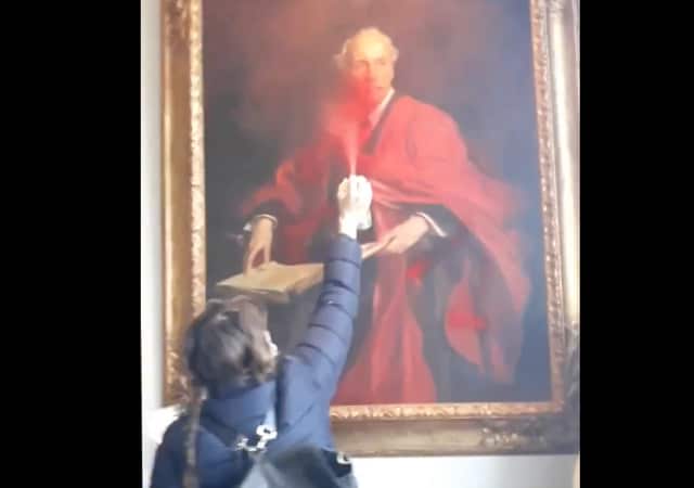
There are two main problems with much of modern art. One is the normalization of absurdity, whereby a blank canvas can be, and has been, featured in art galleries as an ingenious achievement. The questionable aesthetic of basic shapes and child-like scribbles that claim to be sophisticated art is an attempt to discredit traditional beauty standards and elevate the lack thereof as the new normal.
The second problem, which is even more sinister, goes beyond the subjectivity of taste and the absence of meaning and beauty. It is the insertion of woke ideology and social activism into artistic representations. It is the purposeful rejection and ridicule of the Classical concepts of beauty, goodness, and truth as part of the patriarchy, colonialism, and oppression narrative peddled by the haters of Western civilization, who have hijacked American culture and education.
This narrative has culminated in obscene representations that assault Western tradition and social norms, such as various elephant dung works that disrespect Christianity or the infamous Petra sculpture depicting a urinating policewoman in riot control gear.
The same narrative has also damaged our appreciation of the great works of literature or music. Heather MacDonald diagnoses the severity of the problem with surgical precision:
To get a bachelor’s degree in English literature at … [some] of the most prestigious colleges in America, you must take courses in Gender, Race, Ethnicity, Disability or Sexuality Studies; in Imperial Transnational or Post-Colonial Studies; and in Critical Theory. But you are not required to take a single course in Shakespeare.… That movement seeks to infuse the humanities curriculum with the characteristic academic traits of our time: narcissism, an obsession with victimhood, and a relentless determination to reduce the stunning complexity of the past to identity and class politics.
In so doing, the modern professoriate has repudiated the great humanist tradition on which much of Western Civilization, and the Western university, has been built. That tradition was founded on an all-consuming desire to engage with the genius of the past….
The American founders drew on an astonishingly wide range of historical and philosophical sources and on a healthy skepticism about human nature to craft the most stable and free republic in world history. Ignorance of those sources … puts these unique and monumental achievements at risk…. The academic narcissist, oblivious to beauty and nobility, knows none of this. That’s bad enough, but to deny such glorious knowledge and wisdom to students?
That’s a tragedy on a Shakespearian scale.
Nora D. Clinton is a Research Scholar at the Legal Insurrection Foundation. She was born and raised in Sofia, Bulgaria. She holds a PhD in Classics and has published extensively on ancient documents on stone. In 2020, she authored the popular memoir Quarantine Reflections Across Two Worlds. Nora is a co-founder of two partner charities dedicated to academic cooperation and American values. She lives in Northern Virginia with her husband and son.
Donations tax deductible
to the full extent allowed by law.


Comments
Art should say something; not just that, but something worth saying. Recall automobile designs from the past. A Chevrolet, a Ford, a Dodge all had their own design philosophies. Even within corporations, a Pontiac was different from an Oldsmobile, a Mercury from a Ford. And a Mack truck wouldn’t be misidentified as a Peterbilt.
Now everything, with rare exception, looks so similar that it’s necessary to read the badge on the vehicle to see who made it. How frustrating.
.
In the past, cars were designed to be beautiful, as well as utilitarian.
. William Morris said famously in an 1880 lecture on The Beauty of Life “Have nothing in your houses that you do not know to be useful, or believe to be beautiful”
But useful AND beautiful is better.
Today’s cars are designed solely to meet CAFE standards, with a few marginal tweaks meant to hook a buyer.
And that assumes they even show you the vehicle (we’re looking at you, Jaguar).
The auto makers are striving for every last 1/100th of a mile to the gallon that they can get, so, most of the market is “jelly bean” cars.
That having been said, I’ll take the looks of a Mazda or Honda grille (facia) to a Toyota any day!
It used to be that the Dodge was the only car that didn’t need a horn because the fascia read, “Dodge Brothers.”
The homogenization of society. Style in decline.
I’m all for Times New Roman. If it were up to me, we’d kick things up a notch and go with all Latin. Everything is more convincing in Latin.
Tu bene.
Recte dico.
My company has been using Calabri for a decade, and not once did I hear this was a cultural thing.
Publishers choose book fonts for all sorts of reasons, in many cases inventing fonts to minimize print costs (this is why Garamond is popular). https://www.tonerbuzz.com/blog/which-fonts-use-the-least-ink-toner
Agents typically accept Times New Roman, simply because its standard. They don’t complain if it’s Garamond.
Font face at the State Department is about 12467 on my cares-about list. If we are surrendering to Russia, nobody will care whether it’s Times Roman, Calibri, or Comic Sans.
I checked my “Lives of the Caesars, Suetonius” and its delivered to my kindle in Bookerly, although I have a few other options. Everything is delivered these days (PDF, Word, Kindle) electronically, and I can choose a menu of fonts.
I find Palatino easier to read in print, but it’s not a deal breaker. It’s a little different from Times New Roman but in the same vein. I think your cares-about grade of 12467 is fair.
“Times New Roman, associated with “professionalism” and “decorum,” will now be rehabilitated”
Now do twerking congresswomen.
“It is the purposeful rejection and ridicule of the Classical concepts of beauty, goodness, and truth as part of the patriarchy, colonialism, and oppression narrative”
Corporate Memphis delenda est.
I’m a Bookman Old Style man, myself… (in Windows. Macs don’t have it and I need to look to see if I can get it.)
I already answered this in the Rubio article — check it out.
Found it along with Book Antiqua!
Modern art is a period, not a particular style. It includes art created from 1860-1970. When people say they don’t like modern art, they are generally referring to abstract expressionism, minimalism or more broadly, contemporary art. I’m not a fan of non-objective art but I can appreciate Impressionism, Post Impressionism and other forms of objective art or figurative art that are considered “modern” because of the inclusion of new styles and techniques.
Fraktur is my favorite. You never know if it’s an f or an internal s.
Calibri is like New Times Roman with its gender-specific parts hacked off.