Marco Rubio Makes ‘Times New Roman’ Font Great Again
State Department to end Biden-era ‘diversity and inclusion’ initiative requiring use of Calibri font in official communications.
What’s in a font? Apparently a lot.
Adobe explains when to use serif fonts and when to use sans serif fonts:
“Serifs are the small lines attached to letters. Their origins are a mystery; one theory suggests they arose when scribes using brushes or quills left small marks with the writing implement as they finished each stroke. This evolved into deliberately adding smaller strokes in more regular, artful ways, and those decorative strokes became an expected part of the letters….
Serif fonts can look authoritative, professional, and suggest the weight of history or experience. Serif typefaces like Times New Roman are suggestive of typewriters’ old style — The New York Times and other reputable institutions that have existed for over a century still use this font….
Sans serif typefaces were controversial when they first appeared and were sometimes called “grotesque” typefaces. But when modernist designers like the Bauhaus movement embraced sans serif typefaces, they became associated with cutting-edge design, commerce, and modernism’s attempt to break with the past.”
Times New Roman is a serif font. Calibri is a sans serif font.
Battle of the New Romans 😵💫 pic.twitter.com/YzQl0gwrZS
— Climate Watcher 🔥🇯🇲🇨🇦🇬🇧 (@pmagn) December 10, 2025
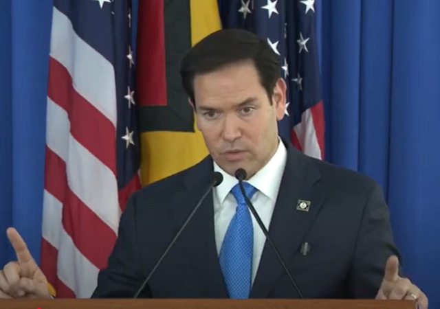
Marco Rubio and the State Department have nuked the Biden-era use of Calibri, and have restored Times New Roman to State Department glory.
The NY Times broke the story, Rubio Deletes Calibri as the State Department’s Official Typeface:
Secretary of State Marco Rubio waded into the surprisingly fraught politics of typefaces on Tuesday with an order halting the State Department’s official use of Calibri, reversing a 2023 Biden-era directive that Mr. Rubio called a “wasteful” sop to diversity.
While mostly framed as a matter of clarity and formality in presentation, Mr. Rubio’s directive to all diplomatic posts around the world blamed “radical” diversity, equity, inclusion and accessibility programs for what he said was a misguided and ineffective switch from the serif typeface Times New Roman to sans serif Calibri in official department paperwork.
In an “Action Request” memo obtained by The New York Times, Mr. Rubio said that switching back to the use of Times New Roman would “restore decorum and professionalism to the department’s written work.” Calibri is “informal” when compared to serif typefaces like Times New Roman, the order said, and “clashes” with the department’s official letterhead.
Apparently the use of Calibri by the Biden administration was part of a DEI initiative (as ridiculous as that sounds):
Mr. Rubio’s directive, under the subject line “Return to Tradition: Times New Roman 14-Point Font Required for All Department Paper,” served as the latest attempt by the Trump administration to stamp out remnants of diversity initiatives across the federal government….
Then-Secretary of State Antony J. Blinken ordered the 2023 typeface shift on the recommendation of the State Department’s office of diversity and inclusion, which Mr. Rubio has since abolished. The change was meant to improve accessibility for readers with disabilities, such as low vision and dyslexia, and people who use assistive technologies, such as screen readers….
But Mr. Rubio’s order rejected the grounds for the switch. The change, he allowed, “was not among the department’s most illegal, immoral, radical or wasteful instances of D.E.I.A.,” the acronym for diversity, equity, inclusion and accessibility. But Mr. Rubio called it a failure by its own standards, saying that “accessibility-based document remediation cases” at the department had not declined.
“Switching to Calibri achieved nothing except the degradation of the department’s official correspondence,” Mr. Rubio said. He noted that Times New Roman had been the department’s official typeface for nearly 20 years until the 2023 change. (Before 2004, the State Department used Courier New.)
Reuters called it a Font Coup.
Personally, I always go with Times New Roman for legal documents or anything official.
Nature is healing. Times New Roman is great (although personally my favorite font is "Baskerville"). https://t.co/0jCSWaqlhx
— Alberto Miguel Fernandez (@AlbertoMiguelF5) December 10, 2025
Donations tax deductible
to the full extent allowed by law.


Comments
Not Comic Sans?
Please remember that “Sand Serif” was a character in Will Eisner’s original “Spirit” comics.
There was a software company in England called Serif; they made the Affinity suite of creative applications; they are called something else now.
I found it fitting that they were Serif, located in Nottingham.
Serif typefaces are more readable because the serifs draw the eye across the page.
This.
“The change [to Calibri] was meant to improve accessibility for readers with disabilities, such as low vision and dyslexia, and people who use assistive technologies, such as screen readers….”
It’s just wrong to claim that “Calibri is safe and effective.”
It’s long-established canon that serif fonts take less effort to read.
Sans serif fonts are more readable on low res computer monitors. That’s why they exist.
Serif fonts tend to take more space, which is an issue for the phone readers.
Sans serif fonts predate computer monitors, You must be young.
Maybe why they became widespread but computers are not no longer hard to read so there is no need. This entire thing is rather silly and the Dept of State shouldn’t have switched in the first place but radical progressives see nothing too small to meddle in.
San serif is more readable on small screens; Serif fonts are much more readable when printed, or on a high resolution monitor.
Of course, the single biggest impact on readability is “what are you used to reading”.
Arial is pretty standard for scientific stuff.
My own preference is Times New Roman on my emails and anything else personally generated. The serifs are more readable and, IMO, a bit more classy. And on the phone and Fire, dark mode means slightly better battery life, considerably less glare especially in low light conditions, and improved readability.
But to each his own.
.
I liked using Bookman Old Style when I was using Windows. I am not sure where to get it to install it on my Macs.
Tell me where to send it.
(Remember when fonts were big ticket fiercely-defended valuables, like black tulips? Good times!)
Look in /Library/Fonts/Microsoft — I was surprised to find it there. It looks like it came off a 2007 edition of MS Office.
“But when modernist designers like the Bauhaus movement embraced sans serif typefaces, they became associated with cutting-edge design, commerce, and modernism’s attempt to break with the past.”
I encourage people to read Tom Wolfe’s “From Bauhaus to Our House.” for a critique of the Bauhaus movement which made modern architecture ugly, The movement stems from cultural Marxism: fundamentally an attack on middle class (bourgeois) values and tastes. No wonder Biden’s State Department switched to the ugly Calibri typeface. I find sans serif harder to read besides being ugly. Typefaces I like: Baskerville, Times New Roman, Palatino, Bodoni, Lucida, Bookman, to name a few.
Yet another reason to hate the Biden regime.
Bookman or Bookman Old Style is my go to font when I have a choice.
ee above. Same here. Very crisp!
I like Verdana myself but there are a bunch that are good. I immediately throw out all correspondence unread if it’s in Comic
LI appears to be using a san-serif font. What should I conclude from that?
Is it LI, or your browser’s settings?
(Looking at the page details, it is LI. “Lora” with a default to sans-serif.)
That sans-serif fonts may be more readable in lower-resolution dot-matrix based graphics contexts like small tablet and phone displays.
Serif fonts inherently require higher resolution to correctly display smoothly without “jags” in the individual letter displays.
Monospace fonts, where every letter takes up the same space, was created for typewriters and newspaper and is now obselete.
None of the fonts mentioned are monospace.
They are also not obsolete. There are uses for them to set apart from other text, and they prevent kerning issues.
I’ll say that Courier could turn an 8 page paper into the required 10pp. But otherwise they are ugly.
Use of serif fonts are a signal of rampant authoritarianism. And according to the Postwar Consensus, authoritarianism was the cause of Nazi Germany.
/sarc (in case you’re sarcasm challenged) But I’m sure some journalist fool will spew something like this.
Yuppers – to avoid “authoritarianism” we should / must shun everything remotely reminiscent of or rampant in Nazi Germany.
Like Gothic or Serif fonts, Gothic architecture, social security pensions for the elderly, free healthcare, revival of pagan faiths, or autobahns (ie high speed highways). Oh, and don’t forget Volkswagons.
BTW, the Postwar Consensus was the basis for Karl Popper’s and George Soros’ (Popper’s grad student) “Open Society”. How’s that working out for us?
https://www.amazon.com/Open-Society-Enemies-Princeton-Classics/dp/0691210845/
Read the blurb.
Also, read the reviews – and weep.
I could have sworn that the official font of the Biden Administration was dingbats
Or wingdings.
Everything the Biden Administration did was Grotesk.
Now, that was LOL good!
Harris would have introduced sans penis to the workplace. It has been a long day.
Just last week, I took a training about communicating with the public in print. It advised the use of sans serif fonts as more readable. First, I don’t believe that’s necessarily true, and second, font selection helps set a tone or to meet a reader’s expectation of a tone (when the reader expects professionalism, for instance).
TNR Is my go-to text for serious writing. I used two fonts on my résumé – TNR for the body and Garamond Premier Pro for the header (name, address, and contact information). A sans serif font doesn’t set the necessary tone for such a document.
Whoever wrote that nonsense about sans serif being more readable is totally ignorant of all the studies that show the exact opposite. Must be a government expert…
If there are ligatures involved, I can see where sans serif would be easier to read. Don’t forget we now have at least two generations that struggle with connected letters (e.g. cursive).
Off topic announcement:
I am likely to soon start a new job which will require me to move to a remote location with very limited internet access. So I will soon be dropping out of this and other forums. I don’t know how long this situation will last. I might not last in the job, or internet access in that location might improve. But for now I’m getting ready to say goodbye to you all. I’ll still be around for a few days, but I’m not sure how long, and I’ll be quite busy, so don’t expect to see me around much.
Well, darn. Considering the internet is everywhere, this must be a *really* remote location. Happy New Year. I hope the job pays well.
Some smart butt will have something snarky to say but, for one, I’ll miss you and no, I’m not kidding. We may disagree but the point is that we are free to say things that others may find issue with. Such is the principle of freedom of speech.
My prayers are with you.
.
You’ve always amused me with your responses. I will miss that. All the best in your new endeavors! Unless.you are to be stationed in remote Antarctica, I am sure you may find a way to connect back into the interwebs.
So, you violated your parole.
Congrats on the new opportunity. I look forward to seeing your comments and posts b/c they are usually well reasoned. I appreciate your willingness to engage, defend your positions and to force others to defend theirs. It has been very enjoyable to have back and forth discussions with you over the last few years. I suspect most of feel the same way. For remote areas I’d suggest ‘viasat’ as an internet option if the job pans out to become long-term, this is what I use in my very rural location. Maybe starlink.
Oh no! I learned a lot from your comments and I’ll miss that education part. The tone is another thing. May it become more humble while you are working in Antarctica.
I hope it works out well for you, Milhouse.
Come back and irritate us again soon. (Despite your occasional pedantry, you do make good comments.)
Likely?
Is this ‘likely’ or certain?
If only likely, why announce anything?
Why not wait until such a thing is certain?
‘Getting ready’ to say goodbye?
Again, uncertain.
What is the point of this?
USAID funds finally dry up completely?
Since high IQ and agreeableness are of equal weight in career success, Milhouse will be a new, net-zero hire.
Awww, dry up.
Oh, hush.
Milhouse, when you KNOW, announce and the site will be draped in black, and a lunar month of mourning will be declared as the commenters, friend and foe alike, beat their breasts over your departure.
As we say in Olde Klingon, teskas tal tai-kleoni
And may the gods keep you.
You are truly a mystery. But a very knowledgeable mystery. Good luck. Come back and see us sometime.
Thanks for the heads up. Antarctica it is…
There’s always Starlink. Equipment fee is $350. Roaming plan is $50 per month for up to 50GB.
Well, dang. I enjoy reading your comments (don’t always agree), but still like reading them.
Get a Starlink dish.
Best of luck Milhouse. I hope you can survive without regular LI posting.
Starlink conquers all.
Buy yourself a portable shortwave radio and a supply of batteries.
Godspeed and God Bless. Stay in touch.
Dammit Milhouse! You would leave us for money? I personally will miss you in your role as the “Loyal Opposition” keeping us honest,
Come back when you can, please.
It is heartening to see the State Department reverting to type.
Dear Milhouse, please be safe and please come back.
It has been a very long time and you have been a most excellent pot stirrer.
What brain cells I have left benefit from your input.
Merry Christmas and a Safe New Year.
I have lost more cells, the above was to have been a reply to Milhouse… sigh.
Unfortunately, those straying cells did not end up with me. Could have used them. Good luck in your search, as I continue my own.
And off Milhouse topic, we will miss pot stirring on this topic.
Thank you Professor Jacobson, a curiously deep and apparently important issue.
Not just the “change of font” but the change of cultural value?
Do progressives have a point that the U.S. Constitution is outdated?
If so, the change of Official Font for internet, phone interface should be considered?
14thAmendment 1868 is distant from airplane and speed boat travel?
So much cognitive dissonance.
Milhouse please come back.
Professor Jacobson be cautious and well this season. Blessings to you and yours.
My main problem with most sans-serif fonts is that there is no way to tell a ‘l’ from an ‘I’. Which does matter. Also, I think the kerning in most sans-serif fonts makes “rn” frequently look like an ‘m’.
I reject most of the font changes simply because they are imposed by Microsoft as default. So, despite their actual changes in letters and kerning, they just shove their way into your documents and spreadsheets, warping your careful formatting. And M$ does it just to make things different. F them.
There was a reason that the Comics Code Authority forbade dialog with the word flick, or characters named Clint.
Times New Roman is a good font because the capital I has the horizontal elements that keep it from looking like a one or a lower case L.
Calibri sucks.
That’s what I said. 😉
As long as Enforce Browser Fonts is maintained as an extension I don’t care what fonts you guys prefer in your MS-DOS dark mode displays.
I was a CP/M man, myself…
In 1992, NASA studied typography for flight deck documentation. Very interesting IMHO- fonts (serif/non-serif), columns, upper/lower case, etc.
https://ntrs.nasa.gov/api/citations/19930010781/downloads/19930010781.pdf
The changing of fonts by the Biden Whitehouse for Dei from serif to san serif reads like something out of the Babylons Bee.
It was coincident with Biden’s change from belt to Sansabelt.
I prefer the slightly wider Georgia font for regular writing. It’s highly readable and it’s weighty. Sans fonts always seem like Danish modern furniture to me.
For my letterhead and similar, it’s blocky Copperplate. Reminds me of old timey writing in the sides of brick buildings from the fin de siecle period. No, I’m not quite that old, but most mornings it sure feels that way.
I like Georgia and Palatino (forced to use Times NR at work). There is a free app called AADV Font that allows you to change the fonts on your windows computer. I change most of them so it is easier to read the names of folders and menus.
This must be a corollary to the old adage “Disputes in academia are so bitter because the stakes are so small.”
Is this a bad time to mention that those letter designs are actually “typefaces.” A font is a variation of the original typeface design (thinner, thicker, elongated et cetera).
Funny how this article is sans serif.
Try Baskerville.
https://upload.wikimedia.org/wikipedia/commons/thumb/1/16/BaskervilleSpec.svg/300px-BaskervilleSpec.svg.png
There’s two kinda people in this world: Elites, & Picas.