The internet reacts to Hillary’s campaign logo
Consensus is unified: the arrow/H thing is weird
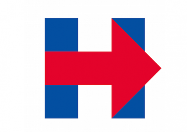
Much in the same way President Obama’s campaigns featured a reimagined ‘O’, Hillary Clinton’s bid for the White House includes a reconfigured letter ‘H’.
The internet though? Less than impressed with the embattled former Secretary’s branding effort. Interestingly, it’s not just the intrepid photo shoppers who are having a jolly good time at the awkward H’s expense.
Even The New Yorker was… confused:
The Daily Cartoon by @EmilyFlake: http://t.co/E95fz5eOhQ pic.twitter.com/32stkxPOBC
— The New Yorker (@NewYorker) April 13, 2015
Ironically, Wikileaks seemed to think Hillary ripped off their logo:
Hillary Clinton has stolen our innovative WikiLeaks twitter logo design. Compare: @WikiLeaks vs @HillaryClinton pic.twitter.com/mifka4mXf4
— WikiLeaks (@wikileaks) April 12, 2015
Could Hillvetica be the font that finally replaces Comic Sans as the worst font in all of fontdom?
Haha yes #Hillvetica by @RickWolff pic.twitter.com/752lfP96Yi
— Amanda Rainey (@vodkandlime) April 14, 2015
Quilt anyone?
Who will make me this quilt? pic.twitter.com/UVQZbpL2bO
— southpaw (@nycsouthpaw) April 12, 2015
Hilarious and also the handy work of John Ekdahl of Ace of Spades fame:
Maybe it was just a typo though:
@jimgeraghty Correcting a "typo" in @HillaryClinton's presidential campaign. pic.twitter.com/K2a5PZdVvs
— David Mullin (@RD_Mullin) April 14, 2015
Or maybe they forgot this important detail:
More accurate version of Hillary's logo. pic.twitter.com/g61ws74K3Y
— Razor (@hale_razor) April 13, 2015
Professor Jacobson nailed it:
#HillaryClinton: Years of planning and millions spent, and all I got was this lousy stock logo http://t.co/PvA854mk92 pic.twitter.com/pOJPezaw7Q
— Legal Insurrection (@LegInsurrection) April 12, 2015
This was bound to happen eventually:
Today's @billbramhall cartoon, on that @hillaryclinton campaign logo: http://t.co/1BPy0aTbbf pic.twitter.com/9D8eNW8YiO
— Josh Greenman (@joshgreenman) April 13, 2015
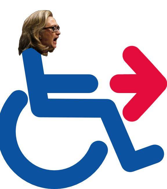
I kept wondering why Clinton’s H/arrow thing looked awfully familiar. And then it dawned on me that it’s because I own something remarkably similar…
Follow Kemberlee Kaye on Twitter
Donations tax deductible
to the full extent allowed by law.


Comments
The Scarlet Letter.
Graphically, in two dimension art, there are two basic ways to denote motion, action, movement. One is by using curves (see the Obama logo) and the other is by using an arrow. Hillary’s has two basic elements, the letter H and an arrow, neither of which are curved, all straight lines. It’s blocky and very static, and likely an accidental retro look, circa ’60s/’70s.
It’s not completely horrible. It looks like the national flag of some northern European country nobody’s heard of.
Quick, without googling, what did George Bush’s logo look like? Clinton’s? Senior Bush’s? Reagan’s? Did they even have one?
I don’t remember any of those. But I do know that in Rubio’s logo, there’s an American flag over the “I”. I know that’s true because CNN told me.
Actually, the national flag it most resembles is the Cuban flag. Check it out.
FedEx logo uses the same arrow graphic.
Best internet interpretation I’ve seen: looks like a plane crashing into two tower buildings…
Did H amas design this for Hillary?
Hamas did give Hillary lots and lots of millions of dollars didn’t they? I’m asking.
“H” for “HIT DELETE!”
“Hit Reset”!
“Hells to the NO!”
It is an absolutely perfect logo for Hillary.
It’s bland, boring, uninspiring, flat, outdated, and unoriginal.
Perfect.
It takes a village idiot.
I kid you not. The first thing I thought of was “abstraction art”…Bill waiting for Monica.
Oh oh! In the right light you can see a lot of white stains on the Blue……….
She’s going by “Hillary”. That’s odd, what’s wrong with using her last name; “Clinton 2016”? Is she trying to hide something or have us forget about what she actually is?
I like the “preparation H” version and Super Mexican’s swastika. This is going to be the gift that keeps on giving (until, of course, she nixes it).
Why does a politician need a logo?
Calling her “Hillary” is sexist, but her campaign wants to use an “H”?
Even The New Yorker was… confused:
And yes, Dave’s Law is confirmed:
https://twitter.com/EsotericCD/status/587634214713090048
“Hell”ary is more like it ~
Regarding the AuH2O button – hillary was a “Goldwater Girl” after all…
Re #Hillvetica letter B: Mad Magazine has font update http://goo.gl/4YWWrW.
To me this says “Hillary, exit stage right.”
Perfect!
http://www.truthrevolt.org/news/hillarys-social-media-campaign-toppled-young-black-republican
Markeece Young, known by his Twitter handle @YoungBLKRepub, is a 19-year-old self-confessed “Democrat-turned-Conservative” who single-handedly took down the social media campaign of Hillary Clinton’s bid for president.
Young created the hashtag #WhyImNotVotingForHillary on Twitter, which quickly rose above “Hillary Clinton” as the number-one trend in America.
————
Site includes the H with a meme of Preparation H and a couple others.
I think it would be a great symbol for directing people to the trauma unit in a hospital.
The saturated red on blue diagonal is a graphic arts no-no. It’s glaring and dissonant. There’s something else that bothers me about this logo too. Can’t figure out what it is.
The diaper-esque red triangle? That is it looks like person in a diaper, sideways.
The hidden swastika interference pattern by the glaring color edges?
The “Exit” sign quality of it?
DEPENDS!
Looks like the symbol they flash on the screen at a Democratic Party Conference when Bill Clinton enters the building
Could it be the symbol of bull dykes?
She really is an idiot.
( — As well as a fraud and a thief.)
Here are some other very funny ones (esp “I’m with stupid”)
http://thepeoplescube.com/peoples-blog/shocking-mocking-of-hillary-s-logo-t16203.html
Ha ha ha, Ho ho ho – forgive me but those take-downs are
HILLarious!!!!!!
Can’t help but notice that the message seems to “point to the right”. Is that what she wants (considering she represents the left)?
From the very first day the campaign was riddled with unforced errors. At this point, her candidacy is much ado about nothing new. Same old same old entitlement attitude.
If only these two grifters would get off the stage already. But then what would the msm have to salivate about??