Going Mobile
Like a whole new website, only smaller.

We did it, we really did it.
After years of reader requests, nay demands, for a mobile phone template we did it. It is NOT AN APP. Don’t ask me how you get the App. You don’t need to download anything.
Apps are so three years ago.
It’s a full blown mobile tempate. Like building a whole spankin’ new blog. Just smaller. And simpler. And hopefully able to load and navigate on your phone more easily.
Since over 25% of our traffic comes via phones, it’s the least we could do for you. Isn’t that mighty nice of us? (Applause)
(added) You can always choose to use the full desktop template on your phone (see image at bottom of post).
Much thanks to Andy LoCascio and his team at Sound Strategies.
The featured image has the narrow banner you will see, with the top post below it.
There is a navigation drop-down menu that looks like this:
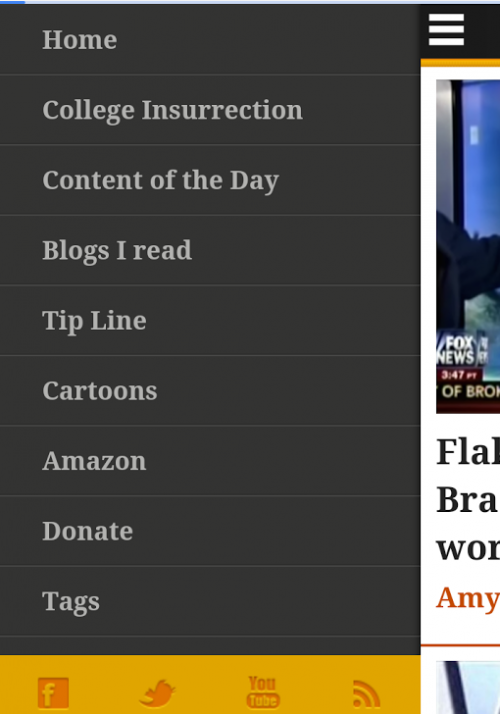
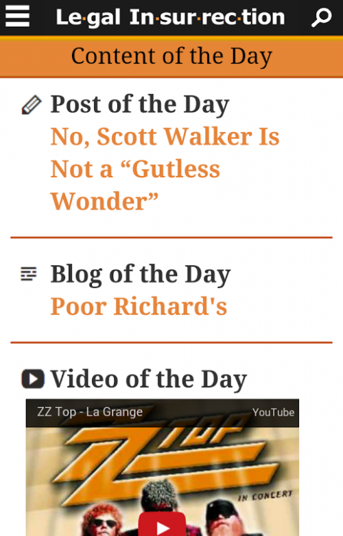
You can get all of the key elements from that drop down menu, including the “Of The Day” entries:
And the Blogs I Read:

You also can shop Amazon (that really helps us, since we get a small percentage at no extra cost to you):

And you can Donate, because did I mention the mobile template was like building a whole new website, only smaller?

(added) If you do not like the mobile template on your phone, you can choose the desktop version instead by clicking at the bottom of the page:

Kinks?
Yeah, we got kinks as in any new website, but we’re working them out. If you notice a problem, leave a comment at this post or contact us. Please specify type of device and model (e.g., iPhone 5).
One issue I know we have to address is the commenting on the mobile site. As of now it has a simplified comment function, which does not let you Reply to people. We’ll deal with that.
Compliments and high praise are strongly encouraged.
Donations tax deductible
to the full extent allowed by law.


Comments
I love it. Excellent job.
Yes, I meant to thank you, Professor. I noticed the change a few hours ago. Wonderful job! So much better now loading the page.
WTG!
I’m sure it’s awesome. Am I required to buy a phone now?
LOLOLOlolo :^)))
so wheres the app to view this one?
LOL you really expect us to type a url into a phone? LOL
joking,
Ah, well now, you could “DIGG” it instead! DIGG works well for gathering up your RSS feeds; replaced., kind of, Google Reader.
My I pad mini can no longer expand the type face and I have to scroll a really long way to get to imbedded content. All of the ads fill in the center in a vertical line. The end of a post like a video is after all of those ads, as well as, all of the comments. I still love the strong content and the cmments
Me too. This SUCKS on an iPad. I see first article, then have to scroll thru the entire LONG sidebar to get to the next article. Not an advancement to me!!!
We are addressing that. Tablets should not be picking up the new mobile template, only phones.
I’ve been seeing that off and on all day on a desktop computer. Refreshing the page sometimes helps, but not always. I’m glad to find out it’s probably not just me. 😉
In case your web folks are interested, I run Windows 7 and use IE10 on that machine. I’m typing this on a tablet. Still seeing the sidebar running down the middle, but it sounds like you’re aware of that.
Thanks for the mobile option, Professor!!
I saw that consistently on my Android phone ~
It looks weird on my iPad, which I normally use “landscape style” rather than “portrait style”. I think I’m seeing the phone version (long and skinny) which I don’t really need. And it leaves me with lots of blank real estate on my screen horizontally and a need to scroll down a lot more than before because the graphics in the right hand sidebar are piled up in the center of the screen, vertically above the text of the post, not over to the right alongside the main text of the post where they used to be. [added: the sidebar does leave a little room to its left for the beginning text of a post, but as soon as there’s anything embedded in the post’s body (graphic, video), there’s not room for both it and the now-centered sidebar so I have to scroll down, down, down to finish reading the post. This is really hard to explain, sorry].
I’ll try messing around to make sure it’s not an anomaly on my part, and maybe one of you all who has access to an iPad could lock it in landscape and see what you see?
Right now I’m using Chrome on iOS 8.2.
I just tried to leave a long comment, but it’s not appearing.
Anyway, the to;dr was that using Chrome on an iPad 3 with iOS 8.2, in landscape (not portrait) orientation, I’m only seeing a very skinny and very looooooong version of the page. I now have heaps of blank real estate horizontally and have to scroll down, down, down, down past what used to be the right sidebar but which is now in the center of my screen, to get to the body of the post.
Have your guys test it on an iPad and see what they think.
Now I’m trying it in Safari, and see another interesting anomaly. I wasn’t logged in, and it looked fine. I could even read all seven previous comments (including the two I thought didn’t post because I couldn’t see them).
As soon as I logged in though, the proportions went all wonky again; I’m back to the sidebar being in the middle instead of to the right of the main body of the post. And I can’t see my previous two comments anymore either.
Happened to me on Google Chrome!
Here’s an odd one, Samsung Galaxy Note 3, view in portrait is mobile site, switch to landscape view, and it goes to desktop site. Also, comments in mobile spill out of box.
However, this was a welcome surprise this morning!
Regarding comments, I’ve just checked out other posts and it seems I can’t view anything but the first five comments on any of them. When I’m logged in.
When I’m not logged in, I can see all of them. That’s the case on both Safari & Chrome, iPad 3, iOS 8.2.
So, since LI now “listens” to its vast audience, Ok, hopefully HUGE audience, how about providing a Print article function, like there is on PJMedia’s site, like for VDH’s articles, please! Thank you in advance.
That way I can readily print out these wonderful articles, which they are, and share them with troglodytes, like some of my friends!
So, now when is LI’s listening tour going to get to the great upper Midwest, this great beating Heartland, of these US?
So I was talking to an attorney colleague at my office today, he comes over from time to time to use some of my office space, and we were talking politics as we are wont to do, and I mentioned your site…. So, I had my iPhone 5 in my hand, and I pulled up your site, and what to my wondering eyes did appear? But a mobile Legal Insurrection website!
I handed it over to him, and perhaps you’ll have another new visitor soon!
Personally, I liked the old one better. That said, two thoughts on the new version and my iphone 6: 1. Hold the phone vertical and I can’t thumb up/down or reply to comments, while holding phone horizontal allows my two cents worth. 2. ‘don’t like the “more comments” button. Can’t we read all comments w/o going through contortions?
See info we added to the post — you can choose to look at it with the desktop view on your phone by clicking “Desktop Site” at the bottom of the homepage (see image in post).
Isn’t that mighty nice of us? (Applause)
Oh, no! That applause is triggering feminist anxiety in me.
Please, glad hands only!
I just had a website built for my grandson and they now use what is known as “responsive templates”, which means the site is adaptable to a desktop pc, a tablet, mobile phone, etc. LI seems to use a different technology which is probably more sophisticated and exact. My understanding is it takes a lot to make a current site “responsive” which may be the reason LI’s team took this approach. I just looked at it and it is very nicely done, and easy to view on the phone.
Too bad 1 of every 3 times I come here on my Dell laptop, I get the mobile view – I do not like it – too hard to read
I have to scroll down through a bunch of crap that use to be on the side like PayPay, blogs I read, video of the day and Blogs I read to get to the meat of the article.
This is what you could call diversity for viewers.
This really sucks.
I’m not offered any “desktop view” option at the bottom of the home page, FYI. This is your footer at the bottom of the home page as I see it in both Chrome & Safari: http://i.imgur.com/knTCMzY.jpg
Also, still can only see the first 5 comments (and their replies) on any given post; no option given to “view more” or anything.
Hopefully someone on your tech team has access to an iPad so can see how mucked up everything is now.
Another screenshot, iPad view of this morning’s Branco cartoon. Have to scroll down through all the now-centered right sidebar items to see body of post: http://imgur.com/7Bd4rCs
Sadly this template doesn’t work on ipads. Please back out and test on all devices. Quite a few people can no longer read LI because of this change.
I’m using an iPad Air with IOS 8.2 and the mobile version seems fine and fast! I like this!
lot of platforms have issues with ipad and ios8+ due to string used.
I forget the fix now but was something edited in user agent on site end.
I read recently that someone released an app that allows you to make phone calls from your mobile phone. What will they think of next?
I think what that would mean is it lets you use free Wi-Fi, or maybe paid for Wi-Fi, to make calls. (and you might drop your carrier, if you have one.)
For crissakes get yerself a sarcasm app.
I’m not able to read any articles on my android phone (gingerbread) because the content tabs (“blogs i read,tip line,cartoons,amazon,etc”) covers up the entire webpage except for a small sliver on the right. If I scroll down, I can see the articles for a brief moment and then the content tab just covers it up again.
Using the wrong terminology here.. the ‘content tabs’ that I mentioned is the ‘navigation drop-down menu’. Is there a way to make that disappear?
I know others have offered similar comments but I read your site on a Windows 8 PC with IE10 and it is not a good experience since the update. All of the stuff that used to appear on the right of the screen now appears in line in the middle of each article. A lot of scrolling is required to get through any post.
However it looks great on my Windows phone.
Much improvement now on iPads. Still can’t expand/magnify text. And are displayed comments limited?
I just wish I could see the same view on my iPad as is on my desktop computer. I used to be able to, with the right-hand sidebar on the right side of the page instead of in a long column down the center of the page, breaking up the post; and all comments visible instead of just the first five with no option to view more.
I hope this is in the works. Till then, I’ll only be visiting when I have access to a desktop machine. Oh well.
Thanks for everyone’s patience with this update. The update was not intended for tablet devices – only mobile phones. We’re working to correct the code that is incorrectly detecting a tablet as a mobile phone.