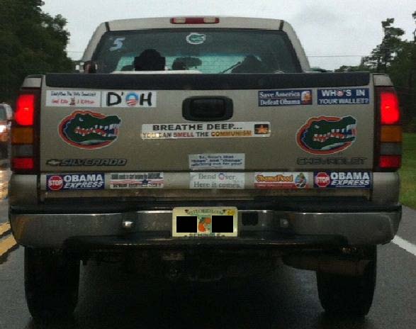
How much fun have bumper sticker makers had with the “O” in the Obama logo?
This driver found a couple we haven’t seen before.
From Cathy, who sent it in an e-mail with a subject line “The Jackpot”:
DONATE
Donations tax deductible
to the full extent allowed by law.


Comments
They could’ve used his initials B.O.
But that would stink too.
A few weeks ago my wife & I saw our first “Obama 2012” yard sign with the “O” logo in the 0 in 2012. We concluded that Obama needs to have this logo for those voters who are illiterate or don’t read English. The message is the icon itself – they see the big “O” and then the rest of his name becomes imprinted in their minds.
We discussed how years ago McDonalds had to “dumb down” their cash registers – if you order a hamburger, the cashier touches the icon that looks like a hamburger.
I sense that this “O” logo is the same concept. If Obama had his way, we would have electronic voting machines with a button with the “O” icon on it.
Want to stump a liberal? Ask them…
Why does Obama’s logo look like a big zero on a highway to nowhere?
I wish I had thought of that.
The Story of O. Masochism and abuse.