When it comes to anti-Israel narratives, what’s new is old.
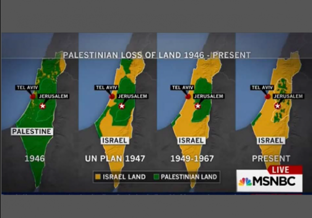
We have covered many times the fake propaganda map that is so popular among the anti-Israel Boycott, Divestment, and Sanctions (BDS) movement supportes, and Israel haters generally. It purports to show “Palestinian” loss of land, but it’s a fraud. The land never was “Palestinian” — It was the British Mandate under British control, along with what now is Jordan.
With good reason, the map is dubbed “The Map That Lies.” In 2015, we covered how MSNBC used the map, then apologized when shown why it was misleading and deceptive, MSNBC uses anti-Israel propaganda map (Update: Admits error)
The map has been debunked so many times in the past, a simple Google search would have demonstrated the problem.Elder of Ziyon blog has written a definitive taken down of the map in 2012, The Map That Lies. The Tower magazine has an exhaustive research post on why the map is a lie, The Mendacious Maps of Palestinian “Loss”. Even The Economist had an explanation why the map was deceptive in 2010, when blogger Andrew Sullivan used the map.Most important is that Map 1, which purports to show “Palestinian land” as comprising most of the British Mandate (after Britain already has lopped off most of the Mandate land to create Jordan) does not show “Palestinian” land at all. As Elder of Ziyon explained, that land was mostly public land, and there was no country of Palestine…
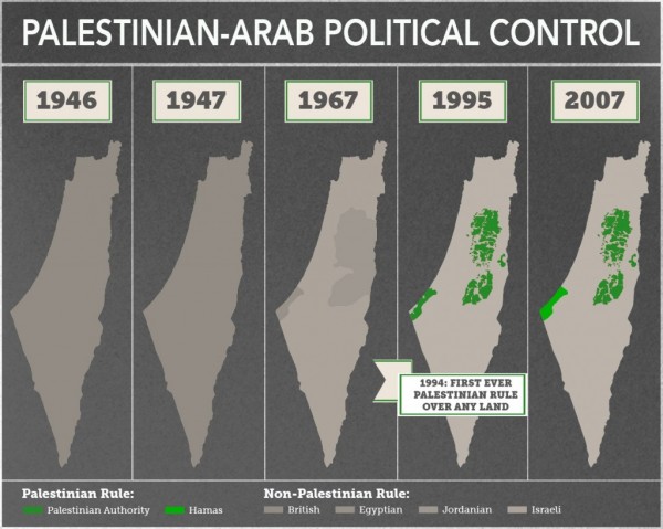
This map from The Tower article demonstrates a more realistic history:
The New York Times just ran a version of The Map That Lies as an illustration to a mendatious anti-Israel Guest Essay by legal polemicist Diana Buttu:
The visual was spread far and wide as the NY Times essay was shared on social media, including by the Washington Post “fact checker”:
The reaction calling out the Map was swift:
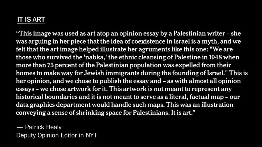
These were all things that I knew, and then I saw this quote attributed to a NY Times Editor posted, admitting the map was “art”:
I reached out to the NY Times Editor multiple times, but received no response.
The person who posted it, however, provided me with the source, it was an email from him complaining about the map and the Editor’s response (redacted):
COMPLAINT
Hello,I found an error in the opinion article “The Myth of Coexistence in Israel” by Diana Buttu published in May 25, 2021The New York Times created this illustration version of the controversial map that might be also known as “Palestinian loss of land” map.
This map if not factual accurate. In 2015 it was published in MSNBC and they later apologise for it stating “the maps not factually accurate and we regret using them”. New York Cornell University has a page explaining why these maps are criticized.It is important that a news outlet big as The New York Times will give significance to facts and will fact checked itself.As your subscriber I expect you to make a correction in the article and also replace the main picture of the article, because the map is also appear as the thumbnail of the article where no explanation can be provided to the glance readers.Example: how the map is showed in a tweet https://twitter.com/ nytopinion/status/ 1397310038981677068 As we have seen recently there is a rise in antisemitism attacks on Jews in the US and abroad, this kind of misinformation are a major contributor. It’s important to address this.Sincerely,Your subscriber and reader
RESPONSE:
Hi [xxxxx], thank you for reaching out and sharing your concerns. I’m the deputy editor for the Opinion section at the Times. I’d like to share our thinking here, and hope it goes some way to explaining the use of this image. This image was used as art atop an opinion essay by a Palestinian writer — she was arguing in her piece that the idea of coexistence in Israel is a myth, and we felt that the art image helped illustrate her agruments like this one: “We are those who survived the ‘nabka,’ the ethnic cleansing of Palestine in 1948 when more than 75 percent of the Palestinian population was expelled from their homes to make way for Jewish immigrants during the founding of Israel.” This is her opinion, and we chose to publish the essay and — as with almost all opinion essays — we chose artwork for it. This artwork is not meant to represent any historical boundaries and it is not meant to serve as a literal, factual map — our data graphics department would handle such maps. This was an illustration conveying a sense of shrinking space for Palestinians. It is art.I very much take to heart your concerns here, and share them with regard to rising antisemitism attacks on Jews in the US and abroad. Bret Stephens wrote a powerful column on this Monday night, as did Michelle Goldberg here.[xxxx], my colleagues and I deeply appreciate you subscribing to the Times — you’re supporting our mission, and our ability to do news gathering and opinion writing in places like Israel and the Middle East. I respect where you are coming from here and am grateful for the chance to share views on this.Best, Patrick
Multiple requests to Healy and other Editors seeking comment on the email have not been responded to.
This is how propaganda spreads. The map is a powerful visual, but it’s a lie. The Map That Lies.
CLICK HERE FOR FULL VERSION OF THIS STORY